Of course, there have been some sensational shirts since the competition's inception, with the late 1990s and early 2000s a particularly fruitful era of kit design. However, for every stunner, there are two or three absolute stinkers. You can probably picture them now.
The monstrous patterns, the hideous colour combinations, the ludicrous collars. There are plenty of eyesores to choose from. So, that's exactly what we've done.

Here are the worst Premier League kits we've ever seen. Brentford's stint has been characterised by some awfully mediocre kits but the Bees' 2022/23 third shirt is actually offensive to the eyes. Cooked up by a graphic design intern on Microsoft Paint, the mix of pink and yellow confetti with a hideous betting sponsor has sealed its fate in the worst the Premier League has witnessed.
If a nondescript pattern in pale blue wasn't bad enough, and adidas decided not even to plaster it across the entirety of the Old Gold's 2020/21 away kit. Stopping bizarrely at the shoulders, the only upside of this shirt is that it was donned during a campaign in which supporters weren't allowed into stadiums due to the coronavirus. This one may have been reclaimed by fans and vintage football shirt enthusiasts, but you can't deny the design and colour scheme are honking.
Orange and grey, really? Even Ruud Gullit's dashing good looks can't save this Umbro 90s offering which looks more bizarre with every viewing. Umbro didn't learn from their mistakes when designing Manchester United's 1995/96 away shirt. I believe the official colour name is prison porridge.
Again, this shirt is now adored by Man Utd supporters and kit aficionados for its retro charm but even nostalgia goggles can't make this kit look remotely palatable. Of course, this was also the shirt that Man Utd changed halfway through a 3-1 defeat to in 1996 after Sir Alex Ferguson claimed the players couldn't see one another properly on the pitch. There's probably a reason why you don't see many Jako kits these days, especially in the Premier League.
Their brief stint with Portsmouth during the noughties churned out this abomination. Red and Portsmouth are already an odd combination but washed-out gold accents only make things worse. No wonder Pompey players could only motivate themselves for a 17th-placed finish in 2005/06.
Pink kits are all the rage these days. Clubs often find themselves inundated with orders when they release a nice fuchsia or salmon number but Everton probably didn't have that issue in 2022/23. Alongside Hummel, the Toffees produced one of the most vomit-inducing pink shirts the world has seen, with an enormous betting sponsor hardly helping matters.
Palermo would have been ashamed of this one. We've tried to limit the number of goalkeeper shirts on this list because, well, they're pretty much all hideous. But for us, this is the worst the Premier League has had to endure.
The colour clashing is on another scale as Pony sacrificed their reputation as a kit manufacturer in the late 1990s. Sorry fans, this is woeful. What you may have already noticed is that alternate shirts tend to be much more grizzly than home outfits.
Manufacturers play a riskier game with away and third jerseys and it often backfires. Chelsea's 2012/13 third shirt is an example of the pointless patterning on an alternate kit, with some needless yellow accents whacked on the torso and stomach. Kappa endured a bit of an identity crisis after the 1990s and mainly took it out on Fulham, for whom they seemed to have a particular hatred.
How else do you explain this 2012/13 away shirt? A deep orange with black trimmings could work quite nicely but this certainly doesn't, with a strange scooped collar and some unnecessary side panels. Dimitar Berbatov deserved better. Not so affectionately known as the ice lolly kit, it's little surprise that this was the year that surrendered the Premier League title to .
After all, how can you have pride in your performances while wearing a rhubarb and custard combo? Puma had a rocky start to life as Man City's kit manufacturers and this is by far their most terrible creation. Highlighter yellow is rarely going to facilitate a beautiful football shirt but it stands no chance when you whack a bunch of jumbled Blackburn Rovers crests across it. One sleeve tattooed and the other not, this thing is quite frankly a disgrace to the good people of Lancashire.
Under Armour are among the worst kit designers the Premier League has seen, offering consistently dull and ugly kits. Unfortunately, Spurs had to endure their awful outfits for much of the 2010s. The 2014/15 shirt is particularly bad, mainly down to the needless navy blue stripe emblazoned across the chest.
The collar is pretty terrible, too. Has there ever been a more awful sponsor than Wonga? That's not the only abhorrent thing about 's 2014/15 shirt, which has gone for a bizarre V-neck vibe that only serves to emphasise the hideous sponsor. Watching John Carver's Newcastle in this is an unrivalled form of punishment.
The same season as Newcastle's monstrosity, Puma provided with a disgusting trio of shirts, the worst of which was the third jersey. Arsenal's Puma days represented a dark era for the Gunners but it may have been slightly more palatable had supporters not had to look at such an appalling array of shirts. Asymmetrical kits are tough to pull off and found that out the hard way in 2020/21, donning what became known as the zebra kit.
A very lopsided zebra, that is. It was and still is the single worst kit Man Utd ever produced - honestly, try and find one that's worse - and proves that designing kits based on animals is a sure-fire way to fail. Let's start with the obvious.
The Middlesbrough club crest is on the sleeve. Please don't do that. Secondly, a pattern that resembles your grandmother's tableware is unlikely to go down too well with supporters.
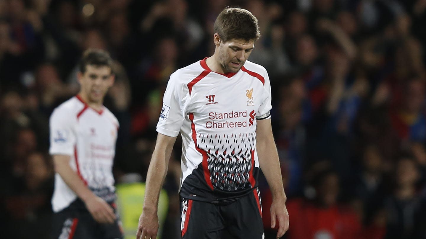
The strangeness of Boro's kit was epitomised by their season wearing it, with the Yorkshire outfit reaching the League Cup and FA Cup final (losing both) and getting relegated from the Premier League in 1996/97. One of Liverpool's worst modern memories came in this absolute howler of a football shirt. Of course, that was 'Crystanbul' at Selhurst Park, which saw the Reds throw away a three-goal lead in the final 11 minutes against as they fought for a first Premier League title.
It's perhaps fitting were wearing such an awful shirt for such an awful night, with Warrior failing to produce a single good kit in their three-year spell with the Reds. In more proof that vintage doesn't always mean good, we bring you Nottingham Forest's 1995/97 away shirt. The dripping ink look that the Midlands club went for - exclusively on the shirt's shoulders - is peculiar, to put it nicely.
Teamed with a ludicrously large open collar, this was another stinker from Umbro in the 1990s. Warrior may be the worst kit manufacturer in Premier League history. Imagine forcing Steven Gerrard, and to don this absolute horror show? It may not be quite as eye-catchingly bad as their other Liverpool shirts but the grey ruff around the collar is one of the worst things to have ever been put on a football kit.
Who remembers Coventry's shocking red and white away kit, worn during the 1992/93 season? — 90s Football (@90sfootball) The inaugural Premier League season boasted the worst kit we have seen and Coventry City are the unlucky winners on this list with their raw meat-inspired away jersey. They may have only finished 15th in the league in 1992/93 but they deserve some sort of trophy for putting up with this shirt on their away travels throughout the campaign..