Summary San Francisco International Airport unveiled a new logo to represent its history and commitment to modernization. The Bold light blue design reflects the airport's new vision of prioritizing people and the planet. The Rollout will take a few years, starting with digital platforms.
San Francisco International Airport unveiled a change to its brand after more than two decades. The airport revealed a new logo, retiring its previous design known as the “flight lines” logo. The change, which incorporates bold, light blue lettering, is reportedly intended to represent the airport’s history, while being brighter and more vibrant than the former look.

Although the logo was unveiled earlier this week, the airport says it will take “several years” to replace the previous design. New & modern SFO announced on Wednesday that its new brand resembles its “ongoing commitment to modernization and extraordinary passenger experience.” The last time it introduced a new logo was 24 years ago.
Ivar C. Satero, the airport’s Director, spoke about the new design. “We are excited to introduce our new brand and logo, which reflects the exciting changes happening at SFO.
Much like our old logo marked a period of time in the early 21st century, the new logo shows our commitment to deliver an airport experience where people and our planet come first.” A new vision The new look comes after extensive research through the collaboration of local designers over 18 months, according to the airport. Last year, SFO launched a five-year strategic plan to focus on sustainability and the passenger experience .
The light blue primary color is called “SFO Golden Hour Blue,” and pays tribute to the past. “From the fluid path of the S to the wing of the F, to the portal of the O, SFO’s new logo represents the spirit of our rich history, the dynamism of the present, and the boundless possibilities of the future,” the airport said. “The logo also reflects our new Vision: Inspiring the Extraordinary; and our new Mission: Delivering an airport experience where people and our planet come first.
” It is the newest space within The Club’s global network of airport lounges. The former and well-known logo was launched on November 29, 1999, to signal the airport’s reinvention for the 2000s. It featured a primarily dark turquoise square backdrop with an arched base.
Two white lines crossed each other near the bottom right – hence the name “flight lines” – and the letters “SFO” were in bold white just above. The rollout of the logo also marked the airport’s first official set of brand guidelines, which included full brand usage, a color palette, and instructions for uniforms. SFO has refreshed the design a few times over the years.
While it has not changed entirely, the airport added subtle elements to provide a more modern look and increase its flexibility. In 2008, the airport’s title was added and both vertically and horizontally adjacent to the flight lines logo. According to the airport, the change allowed for “a more seamless integration on print pieces, and in particular, electronic screens.
” Additional refreshes were implemented in 2013, showcasing a gradient option. However, it was retired after just four years. In 2017, SFO made its most recent update to the flight lines logo, returning it to the flat look.
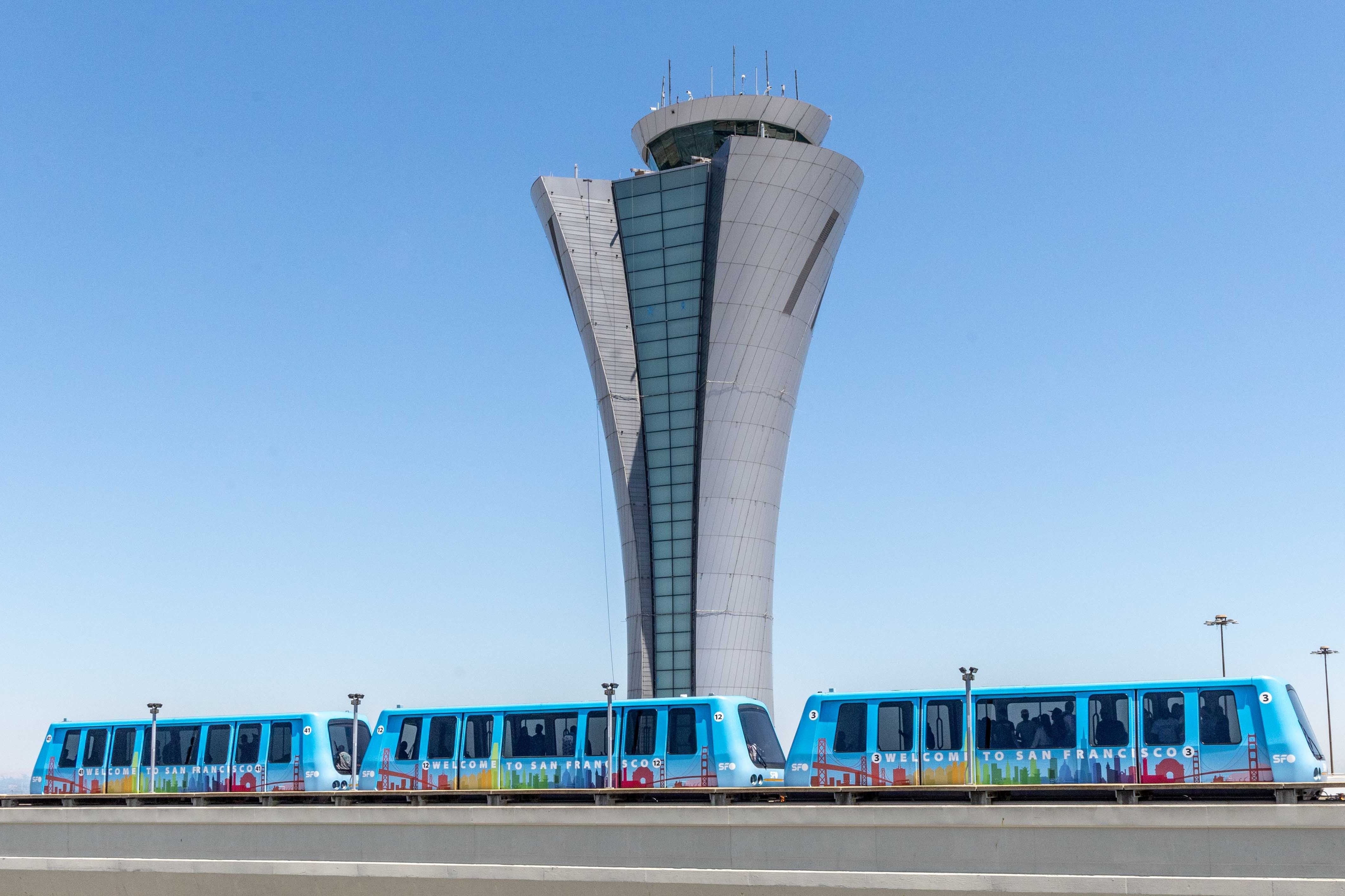
Rolling out the new look It will be another few years before the new logo will be seen more widely. SFO said it will first prioritize retiring the old logo on digital platforms, while new and replacement items such as uniforms, buses, and printed messages will follow. The new design will be rolled out lastly on larger construction and capital projects.
“At its core, SFO is about people: travelers, the community, and airport team members,” the airport explained. “The new logo allows for flexibility in creating special-themed logos utilizing the “O”, to reflect the essence of the people and projects that make us who we are.” Soon the airport will be back to parallel runway operations.
.


