The new logo was crafted over the last two years by a working group composed of community members and town officials. They whittled down 52 initial design concepts to the final recommended design presented to the Town Board by group chair Marie Bosman during its Tuesday night meeting. The town was founded in 1809, with Dutch settlers arriving on the land inhabited by Native American tribes.
Former Town Historian Denis Brennan found inaccuracies with the previous logo when he took over the role in 2018, with the prior logo depicting five teepees in the background. The depiction was not accurate, as the Iroquois tribe who inhabited the land lived in longhouses, not teepees. The town then began the process of phasing out the previous logo, which was designed in 1976, forming the working group in 2022.

After conducting a community survey throughout the summer and fall of 2023 , the town hired the Cinder Design Co. of Schenectady to craft potential logos for the committee to consider. “They were not 52 fully fledged designs, but 52 pencil drawing concepts,” Bosman said on Friday.
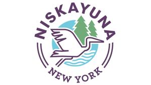
“The artists were working on trying to convey all of the information that we gave them from the community survey and all of the other background that we collected.” The group honed in on a collection of themes, including nature, optimism and approachable for the logo and studied different logo designs that featured corn or depictions of the town’s history of technological innovation, before deciding on a nature theme. The group ultimately landed on the depiction of a heron as the main symbol.
“There’s the love of nature, which was very strongly communicated by the community,” Bosman said. “There’s the ever presence of the river on one side of our town and then we’re very intent on finding symbolism that is very meaningful, not only to the people who live here today, but the people who have always been living here before the Dutch came here.” Town Supervisor Jaime Puccioni praised the working group’s diligence and rigorous process of identifying the final proposed logo, which has a purple, white, blue and green color scheme.
“The final product I find inspirational and stunning,” Puccioni said during Tuesday’s meeting. “When I see herons flying through the sky, I always stop. Even when I’m driving, I say, ‘There’s a heron.
’ I love them and they are a symbol of wisdom, leadership and beauty.” Bosman said the heron was picked in part to honor the town’s Indigenous heritage. “Symbolism that’s important to Indigenous people was well-researched by us and was discussed with members of the Indigenous community,” she said.
“We wanted to bring that in and that is how we found the heron as something that would represent nature, strong Indigenous symbolism and meaning. The river is also something that many people love about the area.” Town Board Member Jason Moskowitz served with the logo working group in the later stages of its process.
He said on Wednesday that he hopes the proposed logo will be adopted. “I’m not only satisfied with the final design, I’m proud of it,” he said. “I’m proud of the work group that put so much time and effort into it.
The amount of volunteer hours that went into this is commendable. They did so much community outreach and spoke to different groups. They got feedback from the community on what was important to our residents and found a way to incorporate everything they learned into this design.
” The Town Board could vote on a resolution to officially adopt the logo as soon as its next meeting on July 23, with the town then planning to place the new logo on flags, town vehicles and on doors inside and outside of town buildings. “Once the logo resolution is passed, we will conduct an inventory of town assets that display the current town logo, then get estimates of the costs to replace,” Puccioni said on Wednesday. “That will determine the timetable for implementation.
” Brennan, who served on the working group, said following Tuesday’s meeting that he was impressed with the group’s process to identify the new logo. “There was a lot of cooperative work and collegiality,” Brennan said. “I think we came to a good final design.
” Working group member Jon Lemelin noted that the group collected community feedback both in person at community events and online throughout the last year. “It was great to see the heron,” Town Board Member John Della Ratta said during Tuesday’s meeting. “We see them on the Mohawk River, but I’ve never associated the town with that.
Seeing that is encouraging and it does give you a sense of optimism. It does bring it back to the Mohawk River, which is a great asset and part of the Town of Niskayuna.” The potential adoption of the new logo arrives a month after the Niskayuna Central School District announced that it intended to retain its Silver Warrior moniker, in possible violation of the state’s mandate to ban Indigenous team names, logos and mascots within school districts statewide by June 2025.
The district removed all Indigenous imagery from its logo and team uniforms in 1997, adopting a white and red “N” logo while maintaining the Silver Warriors name..