A color staple of the late '80s and early '90s, orange was everywhere; from our fashion choices to our interiors, we couldn't get away from this bold, brash color. However, fast forward 30 years and orange color schemes are having something of a revival. These days, decorating with orange is a sophisticated and versatile choice.
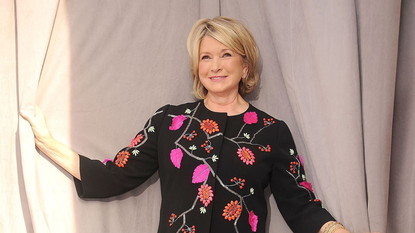
The new burnt orange gracing interiors in 2024 are rich and radiant. It comes as no surprise that America's favorite TV personality Martha Stewart was one step ahead of the color trends with her daring orange three-season room in her former home on Lily Pond Lane. A post shared by Martha Stewart (@marthastewart) A photo posted by on For a decorating scheme with year-round appeal, look no further than the spice and sophistication of burnt orange or terracotta.

A bold, fiery color tinged with hints of red and brown, it is zestier than earth tones, yet offers a smokier, more relaxed aesthetic than brighter hues. Burnt orange provides decorating schemes with energy while imbuing a sense of warmth and calm. To make do like Stewart, pair this surprisingly sophisticated choice with teal.
It is one of the many colors that go with orange and is our favorite. 'I often pair orange with teals as they work effortlessly together,' says Emma Deterding, founder and creative director, of Kelling Designs. ‘It brings warmth and an uplifting energy, whether you use it on a whole wall with paint or wallpaper.
' A versatile shade, teal can be used in contrast with an earthy burnt orange to add more depth to your color palette. A tranquil balance of teal and orange will instantly transport you to sandy beaches and summer skies. Color consultant Clare Tilbrook agrees: 'Orange can look really smart when used together with teal,' she says.
'This color combination works well in a dining room: think orange walls and joinery and serene teal underfoot and on furniture. Accessories and soft furnishings in a shade of blue-green will soften the contrast between the different hues.' Orange can be used as a surprisingly calming backdrop and in my opinion, is the perfect color for a dining room, styled with decorative antiques and jadeite (a favorite of Stewart's) and lots of foliage.
It looks wonderful in a room with plenty of natural light for a zingy, vibrant statement. Design expertise in your inbox – from inspiring decorating ideas and beautiful celebrity homes to practical gardening advice and shopping round-ups. For me, the home should be filled with bright colors as it adds personality to a space.
Orange shades are a great choice – they bring an uplifting feel during the day and can help create a cozy, relaxed atmosphere in the evening. This color combination will always look great when scaled and balanced correctly. Martha Stewart collects Fire-King Restaurantware, a very popular and increasingly hard-to-find type of jadeite.
However, if you're not planning to invest in original jadeite, look to like of Amazon, Target and Bed, Bath & Beyond for similar – just as beautiful – glassware. The teal-like color will sit perfectly against a fiery orange backdrop, similar to Stewart's. Best-seller Pretty storage Color match.