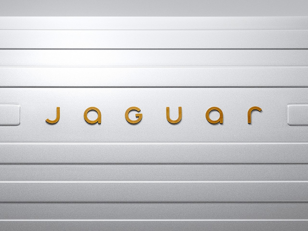
The new logotype, which looks indistinguishable from the Motorola font, makes the Jaguar feel ‘toothless’. I didn’t have a Jaguar rebrand in my 2024 bingo cards, but honestly, this year has been curveball after curveball, hasn’t it? The British luxury automobile brand just unveiled its rebranding, characterized by 4 new elements that make up Jaguar’s fresh look to usher in its EV-only push. The new branding orbits around four meticulously designed elements.
First is the “Device Mark,” a logo stripped of excess yet bold in its restraint. Its symmetry hints at balance—a nod, perhaps, to the duality of tradition and innovation Jaguar aims to master. Then there’s the “Strikethrough,” a graphic motif that almost slices through the air with modernity, destined to carve a permanent space in Jaguar’s visual lexicon.
The “Exuberant Colors” go even further, injecting vibrancy and connecting the brand to the artistic world. Finally, the “Makers Marks”—a duo of the traditional leaper emblem and a sleek monogram—grounds the brand in its storied history while letting its typography flirt with the contemporary. Jaguar’s Chief Creative Officer, Professor Gerry McGovern, frames this shift as a reclamation of identity.
This is a reimagining that recaptures the essence of Jaguar, returning it to the values that once made it so loved, but making it relevant for a contemporary audience,” he says. The implication (given the assets shared by Jaguar) hints at .


