Juicy, lush, vivid, and ripe: we experience summer with a richness in every way possible. A fresh peach dripping down the arm, a rainbow of beach umbrellas seen through the haze of a heat wave, the drip of condensation on the neck of a cold beer, sweating like the rest of us. We view the world in this season through a bright, bold, technicolor lens.
And so do the brands that cater to us—with bold color use, expressive type, contemporary takes on previous design eras, and an evolving approach to authenticity. Truthfully, we’ve been in a season of a more-is-more visual approach for a while now, and while the summer season is perhaps the crescendo of this style, this broader aesthetic movement will stick around long after Labor Day. It’s a philosophy well understood by the late Ettore Sottsass, the postmodernist designer and founder of the Memphis Design group, who was quoted in a 2014 monograph of his work as saying, “When I was young, all we ever heard about was functionalism, functionalism, functionalism.

It’s not enough.” He punctuated his point of view with a case for what it should be: “Design should also be sensual and exciting.” Sottsass came up in a modernist design world that valued rigidity, utility, and simplicity; asking designers to ask themselves what is necessary and drop everything else.
As famed industrial designer Dieter Rams has said, “Good design is as little design as possible.” Sottsass epitomizes basically the complete opposite of that. Sottsass’s work made the case for the necessity of the superfluous.
Expressive use of color, form, and decorative elements are elemental to design done well. In the modern era, design is leaning into sensuality and excitement too. Branding right now is very Sottsass.
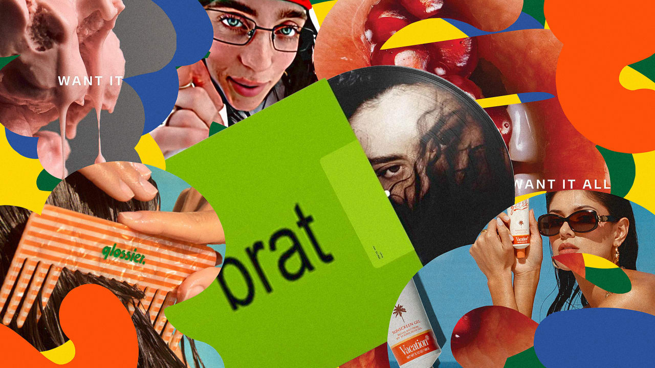
Motifs that call to mind glamorous OOO fantasies, like colorful French Riviera vacations as seen in Glossier’s summer collection ; nostalgic aesthetic callbacks to summers of yesteryear; and the loud, proud self-indulgence of summer as a state of mind , rather than a place, exemplified by Brat green . In the wake of so much broad cultural uncertainty (think tech, politics), consumers are craving a sense of optimism and escape, and that will continue to shape visual design and the way brands speak to consumers. The brands that stand out going forward offer a sense of joy, realness, and authenticity that’s bold, personality-driven, and offers something new to say.
We’re more nostalgic than ever If this summer introduced more of anything, it was nostalgia. Every creative director I spoke with mentioned nostalgia as a visual approach that speaks to consumer culture right now. A somewhat hedonistic, playful fantasy starts to sound refreshing in the face of compulsive doomscrolling and the knowledge that we’ll never return to the carefree summers of our youth.
But whereas nostalgia is usually about waxing poetic for a time that never truly was, now, we’re seeing it used to present romantic, full-saturation visions of our current summer. Summer is more summer than ever before. Expressive typography, saturated visuals, motifs, and colors that call back to European vacation motifs were all over summer 2024.
Cofounder of suncare brand Vacation, Marty Bell, pointing to this moment’s “massive nostalgia wave,” says that “companies are artfully attaching themselves to distinct eras, aesthetics, and subcultures.” He points to the glamour of the ‘60s French Riviera, which they pulled from for their Orange Gelée sunscreen product; European aperitif culture and related nonalcoholic brands like Ghia ; and visuals of Old Mexico exemplified by brands such as Madre Mezcal. There’s not a cobalt blue sans serif in sight.
The last thing you want your summer to be is bland . The styling and creative direction for Sabrina Carpenter’s “Espresso” video , a summer bop as addictive as the caffeinated hard stuff, was inspired by Marilyn Monroe and the ’60s beach glam wave , with retro outfitting and warm pastels that stand out in online scrolls. The music video’s creative directors, Jacobi Mehringer and Anna Arnell, are also creative directors at the marketing agency Wieden + Kennedy (they declined to comment for this story).
Glossier played into the fantasy of a European vacation for its juicy and bright summer capsule collection, Glossier chief creative officer Marie Suter tells me. The team even changed its logo for the collection —the first time Glossier has done so—into a chunky sans with tiny counters and short terminals. The type is set against bright Negroni orange packaging, a core color for the capsule.
The logomark was inspired by the new wave of bold N/A drink brands like Ghia , Suter told me. The Glossier summer capsule also utilizes color in a way the brand hasn’t in the past, adding bright yellow and purple stripes in addition to orange, to evoke the contrasting colors of French Riviera café awnings. “It’s a real sexiness.
It’s a real freedom,” Suter says of the branding and packaging. “I feel like, especially this summer, wIth everything going on in the world, we need joy.” Outside the French Riviera, one of the brands that best captures that preppy summer fauxstalgia is Vacation, for which summer is part of its core brand, selling hot weather and no responsibilities in the name of suncare all year long.
The company released a July summer capsule collection called “Jazz Palms ,” inspired by ’90s tourist shops in Florida and the Caribbean. “This collection, and our merch in general, celebrates an irreverence that’s hard to find these days,” says Vacation cofounder Marty Bell. “High fashion, streetwear, workout gear—everything’s serious business.
Our merch represents a more light-hearted approach to life.” He adds that the brand as a whole nods back to “a more carefree time that many people would love to be a part of now.” Boldness is the new authentic In the 2010s, millennials took over the internet with picture-perfect lives, championing muted pink and Target-friendly living rooms.
But in the past few years, Gen Z flipped the script by celebrating the messy, the unkempt, the real. This was an expression of authenticity in a life lived online, but now, authenticity is becoming less about mess, and more about the bold. “What I react to and what is aligned to Glossier’s aesthetic—I hate that word but it’s true—is an authentic, powerful, confident, clash of worlds,” Suter says, referring to authenticity, and a movement she’s seeing of brands playing with color, and particularly simple type contrasted with strong color.
Suter points to brat ’s green and fashion designer Phoebe Philo’s red as brand identities that exemplify this. “I always come back to authenticity,” says Suter, who says that the term itself has evolved. “I really believe in celebration of whatever it is that you’re talking about, especially humans today.
I really believe in being humble and knowing where your place is today. We’re here to give joy, and if whomever can open their bag and see an orange lipstick and it’s going to make their day better, great, we’ve done our job. That’s good enough.
” There’s also a practical reason for the rise of personality-driven visual languages. We’re spending more time viewing content online than ever before. Gone are the days of tech startups using simple sans serif type to appeal to as many people as possible .
To stand out online in this era, visuals need to stop scrolls at a glance. On Instagram, they need to have a differentiating point of view. On TikTok, they need to entertain.
It’s both a cultural reaction to stressors in tech, politics, and the economy, and a strategic reaction to the mode in which we all view content. “I’m seeing a return to the classic, edgy, authoritative, and provocative,” Chandelier chief creative officer Michael Scanlon, who has worked on campaigns for Flamingo Estate, and Equinox, as well as the Rhode Blush launch in June, says of what he sees broadly in branding at this moment. “We’re all a little fatigued by the everything-for-everyone middle.
I always say, brands need to be standard or sublime, nothing else.” Aesthetically, Scanlon sees more boldness and impact, pointing to the rise in serif wordmarks and graphic, arresting compositions. “We’re all looking for something to cut through the inane numbness of social media and the algorithm,” he says.
Celebrating realness over fakery The tension of high and low references goes beyond brat behavior ; it’s in art direction too. Creative assets, whether video, graphic elements, or entire brands, are becoming more assertive, specific, expressive, and nostalgic. In 2024, polished brand identities coexist with unpolished UGC content (see Marc Jacobs and Loewe’s TikTok feeds as examples).
The text in Gen Z star Chapelle Roan’s Lollapalooza graphics was written in comic sans . Heck, brands themselves don’t need to be so uptight anymore. Different social platforms have different visual needs.
Brand guidelines are just that, not rules. Let’s all live a little. what.
a. crowd. 🙌🙌🙌 @chappell roan performs at #lollapalooza #lollapalooza2024 #chappellroan #chappellroantour #chappellroanconcert #goodluckbabe #chappellroanmidwestprincess #fyp #livemusic It’s also a response to a do-it-yourself cottage industry of creative amateurs who don’t apply the same visual strategy a professional designer might.
Website builders allow people without design experience to create entire websites using AI. Generative AI tools like ChatGPT produce marketing copy with a prompt. It’s democratizing, but also giving the web more generic, C-level “polish.
” “With the boom of e–commerce and content creation, there is way too much design clutter,” says Brent David Freaney , studio principal and owner of Special Offer, who designed Charli XCX’s visually antagonistic, incredibly identifiable Brat album cover. “To me it feels that . .
. we’ve been left with a large homogenous group of Casper Mattress–style brand systems that are way too friendly and way too accessible in their tone. Not everything has to be a perfect match for everyone.
” Improved screen resolutions mean digital assets can also have more detail, and we’re seeing the result in the revival of highly detailed heritage logos, like Burberry’s last winter. At the same time, ‘80s, ‘90s, and Y2K aesthetics are big in branding: print ad throwbacks, low-res video and clip art, flip phones, and Windows ‘98 interfaces. Turns out that after years of slick optimization and corporatization by billionaires, users have a craving for a time when the web was smaller, weirder, and a little more fun.
“There’s obviously the 20-year cycle at play, but it’s also hit at the perfect time from a cultural perspective,” says Noemie Le Coz, cofounder and creative director of Little Troop. “Y2K style now represents a retro vision of the future, so functions similarly to retrofuturism—the high tech, lofty, sci-fi world of Y2K nostalgia offers a level of escapism, fun, and joy that people are craving and seeking right now.” Motifs inspired by techy, Y2K futurism and 2000s tech (like flip phones) are everywhere in brands catering to Gen Z; skincare brand GoodWeird , and seltzer brand Poppi .
Billie Eilish’s music video for her song “Lunch,” used fish-eye lenses, glitchy effects, and saturated colors that recall ‘90s and early 2000s video-editing. (It’s in fashion, too, with the return of low-rise baggy pants and exposed thongs .) A post shared by Poppi (@drinkpoppi) Referring to the Y2K revival, Le Coz tells me, “There’s a carefree, IDGAF radicalism that it also brings, that Gen Z has been perfectly primed to revive and perhaps give access to a bit of fantasy or an opportunity to reimagine the future.
” For Glossier’s Suter, the brands at the forefront of culture in this moment are those that celebrate a sense of realness, and that doesn’t mean “authenticity” as it meant two years ago, when a model might have had a zit left untouched to prove a brand’s authentic bonafides. “Brands, magazines, companies have gained confidence or have learned how to show realness,” she says. “To show someone real, you can still light that person and photograph that person the right way.
” Suter refers to Pamela Anderson’s decision to no longer wear makeup as “incredible.” “What stands out to me are people who do a little something that’s very bold,” she says. “People want this.
People want to celebrate true beauty and confidence.” Apply to the Most Innovative Companies Awards and be recognized as an organization driving the world forward through innovation. Early-rate deadline: Friday, August 23.
.