NBA basketball is about an awful lot more than basketball. Presentation is huge. That includes videos on the jumbotron, on-court presenters, mascots, dance teams, dead-ball entertainment, halftime shows, local television broadcasts, music, the design of the court itself and more.
But the most prevalent and visible part of the presentation might be the jerseys on the players themselves. Throughout most of the two-plus hours of an NBA game, 10 of the world's premiere athletes are on the floor, donning uniforms that say something about fashion in sports, tradition, the region in which a team plays or something else altogether. Over the last 10 years, we've seen some truly awesome jerseys.

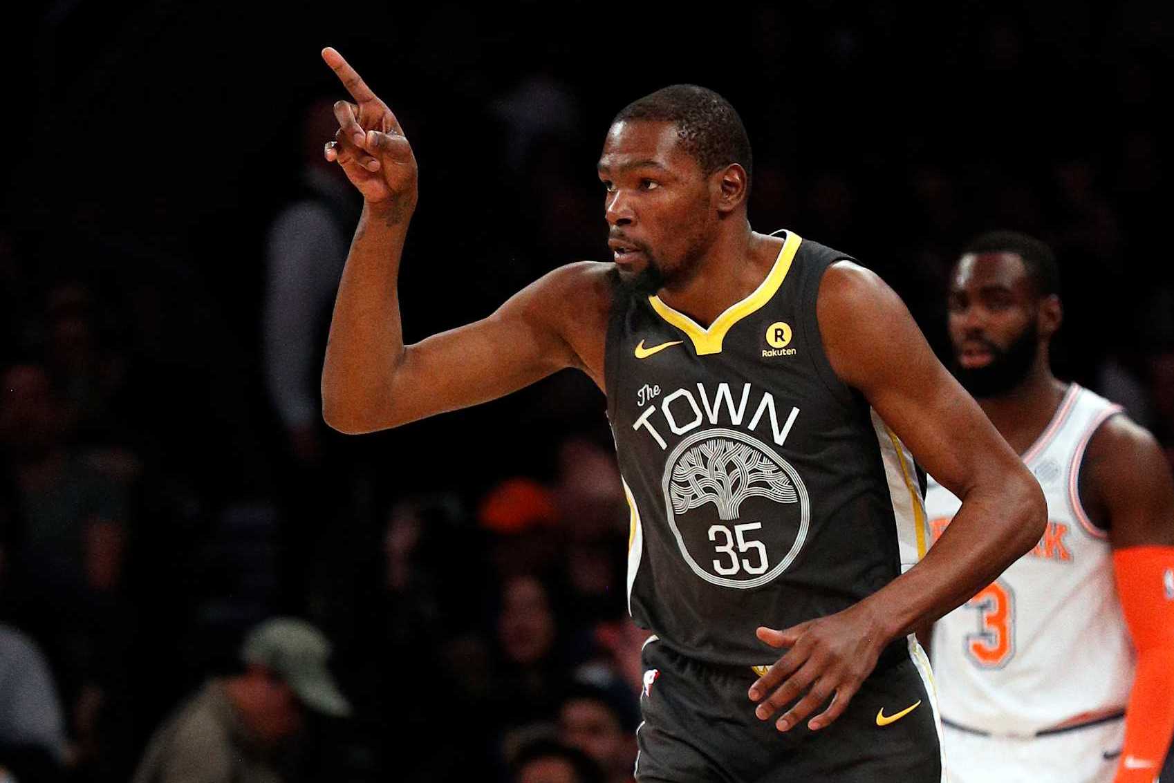
Below, you'll find our favorites. The Warriors' 2017 Statement Edition jerseys, emblazoned with "The Town" in homage to Oakland and adorned with the iconic oak tree that represents the city, were a bittersweet acknowledgement of the team's history. Chase Center was already under construction in San Francisco at the time, and the Dubs would play just two more years in Oakland.
While it's true the Warriors debuted as a California operation in San Francisco, they'd been in Oakland since 1971. Years-long rebranding efforts to make Golden State "the bay's team" never really erased the sense that the Warriors belonged to Oakland. History lesson aside, these jerseys were Golden State's first non-sleeved foray into a black-and-white color scheme.
It was a strong look for what was, at the time, an exceptionally strong team. This was smack in the Kevin Durant era, when the Warriors seemed borderline unbeatable. A band of yellow around the collar tied back to the team's primary colors, the all-caps font of the word "TOWN" popped, and the Oakland tree was an eye-catcher.
All in all, a great aesthetic with some real historic heft behind it. That's how you do an alternate jersey. — Grant Hughes For much of the organization's time in Utah, NBA fans from outside the region have scoffed at the team moniker.
"Jazz" was pretty easy to understand for a squad that played in New Orleans. It's more of a stretch in the Rocky Mountains. But the location and team name really grew together over the years, especially after decades as one of the league's most competitive teams under Jerry Sloan.
Eventually, the Jazz note on Utah jerseys looked and felt normal. Then, starting with the 2017-18 season and running through 2021-22 (with a couple different variations ), the Jazz ditched the note for city edition jerseys that celebrated the natural wonder of the southern portion of the state. Arches National Park and the entire red-rocked region of Utah offers stunning views and vibrant colors you don't often see outside (at least not in the way they appear there).
And the Jazz represented that about as well as a basketball jersey could with these city editions. Beyond that, they looked good in action. And they came in conjunction with a themed floor when used at home games.
Utah has had some iconic teams and jerseys over the course of their time in the NBA, and this one might be the very best. — Andy Bailey Maybe I'm just a sucker for nostalgia, particularly when it's attached to the 80s. Maybe it's why I was obsessed with The Midnight for a few years.
It might be why I can't get enough of Blade Runner 2049. And I'll admit it, it might have something to do with my fondness for these jerseys. But come on, the Miami Heat's vice jerseys, in all their variations between 2017-18 through 2019-20 are just perfect.
The pink and light blue complement each other so well. They're so easily identifiable with both Miami and its history. They looked good during games.
And they're unusual (without crossing the line into weird). There haven't been many pink uniforms over the course of NBA history (the Washington Wizards' recent nod to cherry blossoms is another fun one), but these vice jerseys suggest there should maybe be more. —Andy Bailey When the Toronto Raptors joined the NBA in 1995, the team's jersey featured a dinosaur playing hoops.
It was a classic that was eventually phased out by 1999 for a more traditional (even boring) look. The original wasn't appreciated enough until it was gone, but the team brought it back as a throwback for the 2019-20 season, and it killed. Basketball is a game; let's keep it fun.
More throwback dinosaur jerseys, please, Toronto. — Eric Pincus The Nuggets have had some bangers over the years, but their best looks have always incorporated the city skyline framed against white mountain peaks on a rainbow background. They debuted that basic theme in 1982 and hung with it through 1993, tweaking various aspects along the way.
After messing around with what seemed like UCLA knock-off colors for most of the 2000s, Denver finally returned to its senses and leaned into darker blues and a more classic look. Then, in 2018-19, the Nuggets brought back the skyline/mountain/rainbow theme. Though it was impossible to avoid thinking of iconic Nuggets scorer Alex English when looking at them, they also featured subtle, narrow stripes within the rainbow and lacked any dark bordering around the graphic on the chest.
Cleaned up and simplified, these jerseys were the ideal modernized version of a classic. It probably doesn't hurt that these jerseys made their initial appearance during Nikola Jokić's first season as a top-five finisher in MVP voting. That timing associates them with one of the most exciting and ascendant periods in franchise history.
Though Denver has tinkered with some variation of the rainbow theme in the years since, it only wore the these white jerseys for that one season. Those who aren't fans might argue the Nuggets canned this specific look because it wasn't for everybody, but I'd say their status as a one-off just makes them rarer and more memorable. — Grant Hughes Favorite jersey may be subjective, but come on.
The Phoenix Suns' "The Valley" jersey from 2020-21 was inarguably awesome. With a sleek design, primarily black with bright but non-obtrusive orange, yellow and purple colors, the jersey gives a nod to the city's local moniker. Outsiders may not even know Phoenix is called the Valley locally.
Bring it back, and make it the Suns' everyday look. — Eric Pincus At this moment, I'm struggling to remember the response to the Brooklyn Nets' Basquiat jerseys from 2020. My hunch is that they were, by and large, hit or miss.
Everything comes back to the font choice. Are you living inside a cartoon? Looking at graffiti on a street sign? Poring over a ransom note, written by a third grader, using their offhand, in crayon? The latter would certainly explain the missing vowels. Whatever it is, it's awesome.
And that includes the decidedly anti-vowel stance on the "BKLYN." Including "Nets" inside mismatching, off-center parentheticals is also a nifty touch. These are basketball jerseys.
They don't need to look like they were designed by a habitual "Per my last email" user. (Take note, New York Knicks). If anything, Brooklyn could have—should have—embraced some even wonkier elements.
The white and black jersey bases are fine. But a throwback navy blue or red, in a nod to their New Jersey era, would have played nicely. They also missed an opportunity to be more creative with the jersey numbers.
At the bare minimum, the font could have matched the slanted text. And if they were really willing to roll the dice, mismatched colors on the numbers, like they did with the parentheticals, could have been absolute fire. Despite all of my notes, these jerseys are straight-up awesome—easier to love than hate.
— Dan Favale Small-market teams who are miles outside of the championship race can have trouble catching the attention of the casual fan. The Hornets demanded it with these beauties, though. Folks in Portland and Detroit might disagree, but Buzz City is the coolest city nickname going in the Association.
Leaning into it might be the obvious choice, but credit the Hornets for not overthinking it. And bonus points for writing it in a cool font with pointy "hornet stingers" on the B and Y. I don't know how often the combination of mint, gold and granite works in fashion, but this was an absolute hit.
All three colors carried historical meanings , but more importantly, they just looked good together. The mint color feels fresh (pun sort of intended), but it's also light enough that it lets the gold and granite really pop. And how mean does that gold-and-granite hornet look on the shorts? There's almost a regal feel to it.
It's a shame that the 2020-21 team that rocked these was so forgettable, because these threads were anything but. — Zach Buckley The Portland Trail Blazers' Rip City uniforms are among the best alternative jerseys in the NBA. It goes beyond the incredibly clean look to the meaning of using the name for the city.
The alternate jersey keeps the same standard Blazers colors but moves them around. It has a red streak on one side and the name Rip City in white with a red outline on a black canvas. It is simple in design, but that is its beauty.
That is the mistake with some of these alternate uniforms—they try to do too much. Replacing the name of the Blazers with Rip City is a nod to the team's past also honors their legendary broadcaster, Bill Schonely. The story goes during the Blazers' first season in the NBA, Schonely yelled out "Rip City!" after Jim Barrett drilled a longshot against the Los Angeles Lakers.
It then became his catchphrase anytime a Blazer made a big shot. The phrase has stuck with the team and the city ever since. It is the perfect touch to the Blazers' alternate jerseys and the team's past; there is nothing else you can ask for.
—Mo Dakhil Every iteration of this San Antonio Spurs uniform is dope as hell. The loudest designs are always coolest, which is why they get an A++++ for these teal-heavy iterations from 2022. Is it hyper-practical that you can spot these from Victor Wembanyama's home planet? Without question.
The mismatching accents on the sleeveless rims, in particular, remain an excellent touch years later. The patterns going down the oblique area can be a little obtrusive. They'd be more aesthetically pleasing if the core colors aligned with the armless accents instead of skewing black.
San Antonio makes up for these split hairs with an 11/10 comic-book font choice. I also dig the Spurs logo as the "U" on the chest. Granted, this is another instance where leaning into the wacky might have done more to tie it together.
How about an orange and fuschia alternate-logo horseshoe? Again, though, I'm nitpicking. These jerseys go so darn hard. — Dan Favale.