Whether you’re decorating an entire home or just a small room, it can be a challenge to know where to start when it comes to color scheming. While the infinite spectrum of paints available and the wealth of examples online and on social media offer endless inspiration, this can leave you feeling daunted and unsure about what colors combinations will best fit your project. To help guide your decorating decisions we asked interior designers and color experts for their fail-safe color formulas and color scheming tips guaranteed to create a recipe for decorating success.
Color is a powerful decorating tool that can stamp personality on your home and instantly transform the look and feel of a space. While they can be tricky, getting a room colors right can really enhance a space, making it feel harmonious, balanced and engaging. There are no rules when it comes to decorating, it all comes down to personal taste but, if you’re struggling to work out how to approach color scheming for your home , there are some simple key principles that can help guide your decisions.

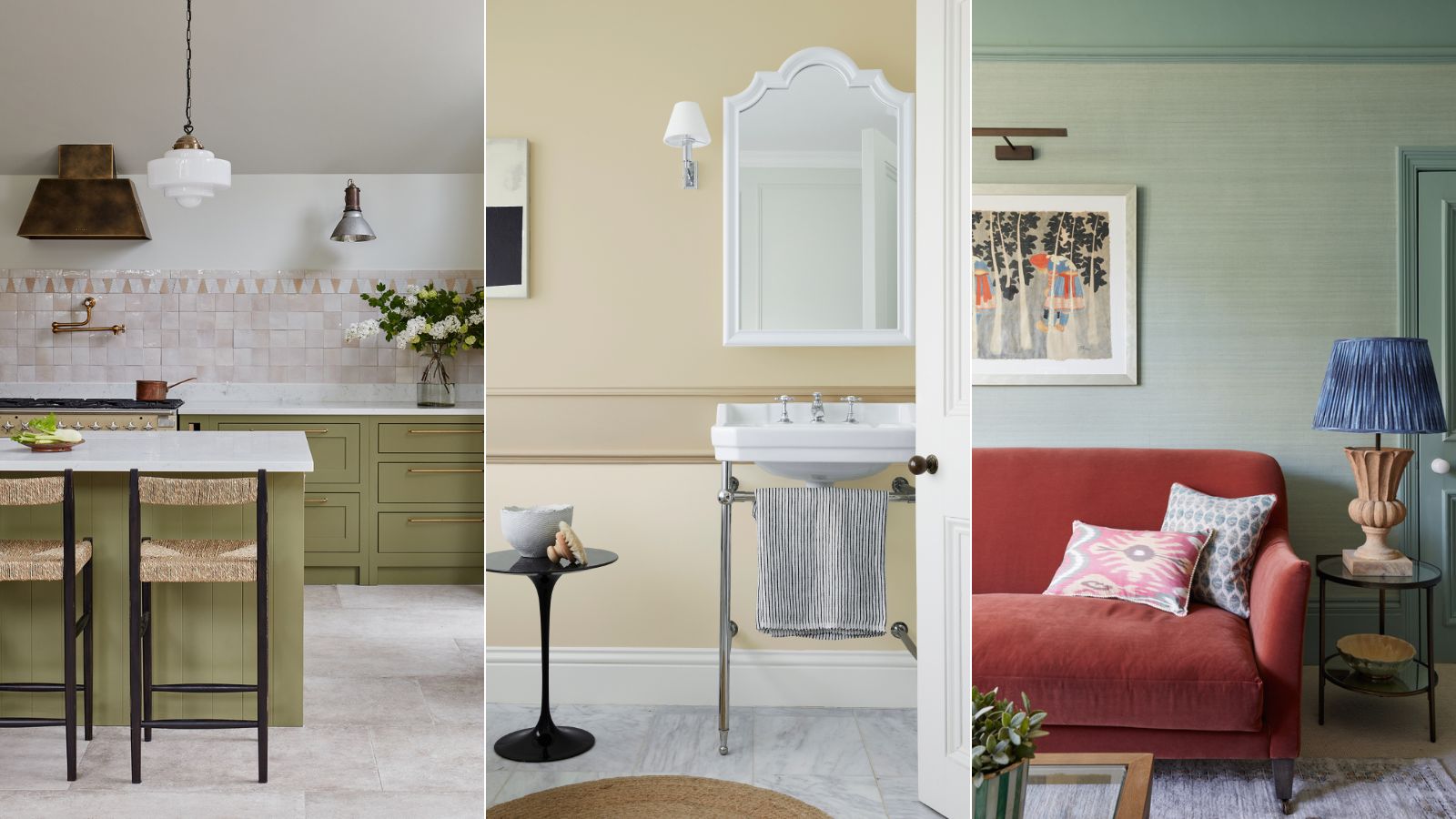
For a timeless color scheme which is guaranteed to endure, you can't go wrong by decorating with neutrals . 'Mixing warm neutrals helps create that classic aesthetic. Choose neutrals with a hint of warmth - think greiges, taupes or even clay tones,' says Emma Deterding, founder and creative director at Kelling Designs .
'They help provide a versatile and enduring backdrop and bring elegance and longevity, especially when combined with natural materials and textures.' However, if you love color but lack confidence, there are ways to incorporate bolder paint ideas while keeping spaces feeling timeless and balanced. Here we've gathered valuable advice from experts for creating schemes that always work.
1. Always think about the light in the room When choosing wall colors, always take into consideration the size and the orientation of the room, as light levels will have a huge impact, say the experts. ‘For poorly lit or north-facing rooms, you need to either consider warmer-based colors (i.
e. colors with underlying red or yellow tones) or embrace the limitations and go dark,’ says Patrick O’Donnell, brand ambassador at Farrow & Ball . ‘South-facing rooms are a breeze and any color will work.
East is morning light, so a little cooler and therefore can work well with soft, pale aquas and blues. Finally, west-facing room see sunshine later in the day and love dusty pinks.’ 2.
Start with a color you love Today many of us are spending more time than ever at home, so it’s important that they are places that make us feel good. For a color scheme that will stand the test of time, choose colors you truly love say experts. While color trends can be useful for inspiration, don’t shy away from the shades that make you happy.
‘My number one fail-safe formula for creating a lovely flow from room to room is choosing one color that you love and letting that be the color that links everything together,’ says Tash Bradley, director of interior design and color psychologist at Lick . ‘It’s fail-safe because you connect with it – it’s personal. By using it in different weights and areas throughout your home you create a color story that links the other rooms together harmoniously.
’ 3. Consider the purpose and mood of the space When decorating think about the mood you want to achieve as this will have an impact on the groups of colors you choose. Ask yourself whether you want a calming space, an energizing, uplifting space, or cozy, cocooning sanctuary.
Generally, cool colors recede and warm colors advance, making certain shades better suited to certain spaces. ‘Warmer tones work best for living room color ideas . Soft ochres or muted pinks can help to create a relaxed and intimate environment that is suited to a space where we relax and unwind with loved ones,' says Emma Detering, founder and creative director of Kelling Design.
'In the kitchen, cooler, crisper colors like pale blues, soft greens or even chalky whites help to create a fresh feeling whilst in the bedroom, rich, soothing shades like deep navy or moss greens are a fail-safe for creating a calming environment that's geared up for a good night's sleep,' explains Emma Deterding. Patrick O'Donnell also stresses the importance of choosing colors to suit the mood. 'All colors have a psychological meaning, so choose a color that’s appropriate for the room you are decorating,’ he explains.
'For example, we know blues and greens can help bring a sense of calm and relaxation, so consider these for your bedroom. Whereas yellows and oranges are energising colors, so are best reserved for a kitchen or playroom.’ 4.
Choose a tonal scheme Finding colors that go together can be tricky, not to mention how to decorate with them and in what proportions. Opting for a tonal scheme layered with different depths of the same color removes this tricky balancing act and is guaranteed to create a timeless look. Many paint companies offer colors in different strengths including Little Greene which has arranged its tonal neutrals in scales on its color card to take the difficulty out of color scheming.
‘Our most popular colors sit within families of four graduated tones, made using the same pigments, but in different strengths. 'Color Scales' have been designed for ease of use and are a timeless choice if you are looking for easy-to-scheme shades,' explains Ruth Mottershead, creative director at Little Greene. 'The Travertine color family is a perfect solution: a versatile warm neutral, Travertine is offered in different strengths, ‘Travertine Mid’ and ‘Travertine Light’ combine beautifully with ‘Travertine’ to create a harmonious design scheme.
' 5. Go for soft neutrals with bold accents If you love color but you aren’t confident using it in large quantities, then opting for a foundation of neutral colors for walls floors, ceilings and furniture, then introducing colorful accents through homewares and accessories, is a fail-safe approach to decorating. Start with a soft neutral on walls and layer with artwork, cushions, lampshades and throws in your favorite tones.
The beauty of this approach is that these pieces can easily be switched up should tastes change. ‘Those who know me know that I'm a big advocate of color, but not everyone is brave enough to go all-out, so there are always some fail-safe color combinations you can use,' explains Emma Deterding. 'One approach is the balance between warm and cool tones.
A soft neutral like warm ivory or light grey paired with deep blues creates a harmonious, timeless scheme that works in any room,’ adds Emma Deterding. ‘It's a palette that offers versatility and sophistication, allowing you to easily layer in bolder accent colors through smaller accents, textiles and accessories - orange would be my go-to for this, adding joy and vibrancy.’ 6.
Embrace complementary colors The color wheel is a handy tool for building color schemes. Choosing colors that sit opposite each other on the color wheel - also known as complementary colors – is guaranteed to bring balance and harmony provided they are used in the right proportions. A master of decorating with color, Laura Stephens has here combined complementary colors of mint green and rusty orange, playing with tone and texture to create a room with warmth and depth.
‘One of my favorite fail-safe color palettes using seafoam green and burnt orange. The pop of burnt orange is essential to add interest to the calming tones of the seafoam green and ties in with the colors in the artwork above,’ says Laura Stephens, founder of Laura Stephens Interior Design . ‘In general, there is no right or wrong when using complementary colors.
A good way to start is to choose a neutral or a toned down blue or green and to then play around with using an accent color on furnishings.’ 7. Layer neutrals for a calm, timeless scheme Neutrals are guaranteed to stand the test of time.
While some may regard neutrals as drab, that certainly needn't be the case. The key, say the experts, is layering. When building a scheme layer in a variety of different shades from off-whites and soft grays to taupes and browns to create depth and be sure to include a variety of prints and textures, as done here by Courtnay Tartt Ellias, founder of Creative Tonic Design .
'Camel, brown, and gray is the trifecta of neutrals and are anything but boring when used together. The warm camel balances out the cool gray and sprinkling in some darker brown usually grounds the room,' says Courtnay Tartt Ellias. 'I’m not known for going completely monochromatic when I use neutrals and that’s why I love mixing shades of neutrals.
This color combo works every time no matter the room.' 8. Design a scheme around a fabric, wallpaper or rug Stuck with where to begin on a color scheme? Try finding a piece of fabric, wallpaper or a rug you love and use it to pick out key colors for your space.
In this living room by Courtnay Tartt Elias the blind and fabric spurred the idea to pair teal with mint. ‘Sometimes all you need is one fabric to inspire the room and it is amazing when you pull it together from there,’ says Courtnay Tart Elias, founder of Creative Tonic Design . ‘I adore this combination.
Blue and green always look great together (look outside at the sky and grass!) but when you nuance the shades the outcomes are always foolproof. In this intimate study, we high glossed the walls in deep teal to make this room more cozy and then painted the ceiling mint. 9.
Use the 60:30:10 rule According to many interior designers and color experts, a fail-safe formula for creating harmony and balance in your home is to use the 60:30:10 rule . ‘60% is your dominant color - this is the main color used in the room and typically covers larger surfaces, such as walls, large furniture pieces, or flooring,' says Tash Bradley, director of interior design and color psychologist at Lick . 'The dominant color sets the overall tone of the space and provides a backdrop for the design.
’ ‘30% is your secondary color. This complements the dominant color and is used in smaller quantities, often on furniture, curtains, or accent walls . It adds contrast, depth and breaks up the main color.
’ ‘10% is your accent color. The accent color should be used sparingly to add pops of interest or highlight specific features. This might appear in accessories like throw pillows, artwork, or small decorative items.
The accent color brings energy and excitement to the room without overwhelming the space.’ Here interior designer Victoria Covell created a calming backdrop with Lick's Teal 01 - her dominant color, then has paired it with a statement sofa in rich plum – the secondary color. Final pops of ochre yellow help balance the scheme.
10. If in doubt go green Synonymous with nature, green is often referred to as a neutral shade and is loved for its soothing qualities and versatility. Soft greens with earthy undertones are a go-to for interior designers and can be used in place of neutrals to create a soothing backdrop which is also perfect for layering.
‘Perhaps the easiest color to incorporate into a scheme is a muted green, neither too warm nor too cool, green is perfect for bringing the natural world inside. Neutral greens work beautifully with other natural and earthy colors creating a sense of harmony, and a restful space,’ explains Ruth Mottershead, creative director at Little Greene. Here Holly Vaughan, founder of Vaughan Design and Developlemts looked to nature to create an enduring scheme.
‘We always focus our work on timeless design and the green kitchen in our Farnham project is a great example. 'Our clients’ wanted an inside-outside feel as the kitchen leads out to a beautiful garden, so we wanted to design it to be cohesive using mainly earthy tones. In such a big, light modern space a neutral color would have just looked too cold and airy, so we settled on green- and this warm olivey tone of green suited the space perfectly,' explains Holly Vaughan.
The beauty of decorating with green is that it pairs well with multiple shades including warm earthy neutrals like ochre and brown through to blues, oranges and pinks. 11. Decorate with atleast three colors Decorating with just two colors can leave rooms lacking in depth, for best results many interior designers suggest working with a scheme of at least three to create interest and warmth.
Mixing a rich tone with a lighter tone of the same color, along with a contrasting accent color, is a color formula we've seen work well again and again for interior designers. 'Using three colors creates a layered visual harmony without overwhelming the space with too many colors. Also known as the 60-30-10 color rule,' says Ali Johnson, co-founder of Otta Designs .
'We like to pair rich warming colors, like this aubergine, with lighter tones for a subtle balance, which creates a harmonious backdrop to then add bolder accent colors on smaller pieces of furniture and accessories. The result feels layered and interesting without being overpowering.' These fail-safe color formulas and tips from designers and color experts are perfect guidance for deciding on your home's color scheme.
Ultimately, interior color schemes are a hugely personal thing, so always go with shades you love rather than trend-led schemes..